Wednesday, July 27, 2016
Philadelphia Library
Community Library
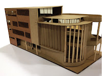
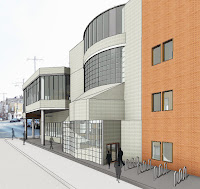
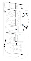
During my senior year at Architecture school, I designed a library located in SE Philadelphia. A library is a community building that allows access to books and electronic resources. After coming from Tokyo, the semester before, I was intrigued by how different types of people would circulate in the space. After being critiqued about my focus on just the space in Tokyo, I decided that focusing on how people really move along the space was more important. Allowing for people to move requires the ability to know what types of people would be coming into the library. So I began my project by drawing some sketches portraying the types of people that navigate through the space.
Types of Spaces
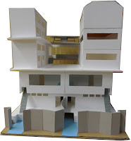
I came up with 3 different groups. The first would be the children, who need the most freedom to access the space. I figured the children should be on the first floor so that they wouldn’t get lost in the library. Then I figured adults would be secondary, so they could be on the upper floors. Allowing the adults to have access to the children also seemed important. So I had open visual access from the 2nd floor. And lastly, I figured people would also probably want to collaborate, so I had a space designed for collaboration, I wasn’t sure where that would go yet. After figuring out with the groups, I made some sketches for how they would look in the space. I drew 3 different types of spaces. Afterwards, I built some models to showcase how the space could potentially look. I wanted curvature spaces for the children and the adults. I wanted people to have more organic atmosphere. Afterwords, I tried meshing the models together. But in order to make room for the staff area, I designed an internal space that would act as the focal point from where the staff would come out. I thought this was important because this allows for interaction between the staff and the people without interrupting the library guests.
Digital Manipulation
After understanding how the people would interact in the space, designing the facades became a priority. I wanted a big opening on the South side as it will receive the most sunlight. The children’s area was also on the side, so that was plus since exposure to the sun would be beneficial for the kids. I was also starting to develop the model at this point, playing around physically and digitally. I made some decisions in Revit that allowed for it to have a second floor vertical louvers so that the sun could be partially blocked. The Review went well for the most part. I was more adamant about my design than the previous semester, when I felt a little taken aback by how people moved in the space. This time, knowing that the people had designated areas and they can perform certain activities in each space convinced me that the location of each space was sufficient. However, having large openings could become a problem did come up. But overall, I was content with the review.
Wednesday, July 27, 2016
Tokyo, Japan
Exploration
I studied abroad in Tokyo, Japan in the spring of 2013. Visiting Tokyo was a very culture opening experience for me. I was prepared for going to Tokyo, I studied Japanese for a couple of years prior, but the magnitude and scale of the culture and architecture was beyond my scope of understanding. When I first arrived in Tokyo, the amount of activity that I witnessed was new to me, I lived in Philadelphia in college but I didn’t exactly live in a big city while growing up, and Philly was tame compared to Tokyo.
I got to explore Tokyo pretty well during my 4 month stay, we were always traveling from one district to another, trying to understand Japanese architecture along the way. Our site for our architecture project was located at the heart of entertainment in Tokyo called Akihabara. That’s where we spent a lot of time taking pictures trying to analyze and understand what it was that made Akihabara so special.
Akihabara is special because it’s the electronics capital of Japan. Games, Anime, Manga, and anything Japan related that pops in the mind probably exists in Akihabara. It’s a small area, but the buildings are tall and the crowd is non-stop at all times.
Tourist Hostel
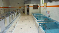
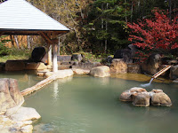
Our architecture class was assigned the role of creating a spa hostel for tourists that would potentially visit Akihabara. Japan is known for it’s Sentos and Rutenburos which are indoor and outdoor baths. So this allowed for exploration of Japanese culture while we designed the hostel. One of the advantage the site has is the Kanda River, which was located just beside.
My plan for the Spa Hostel began with the idea of creating collages to represent a scene that I could picture happening in Tokyo. This was still only my third year in architecture, so I felt a little lost with all the freedom that came with studying in Tokyo. As a result, I decided that just being able to imagine some scenarios into pictures would help ease the transition.
The Events
My collages started with an idea for a lobby. I found some pictures and decided that I wanted a big open lobby that connected to all the other main parts of the hostel. So there would be access to the sento, the rutenburo, the restaurant, housing, and event opening spaces along the way.
The Rutenburo was the second event that I collaged together. I figured having a natural outdoor bath that highlighted Japanese culture should be a big event. I also wanted connection between the Sento so the transition between the indoor and the outdoor was seamless. Thus I collaged together the sento as another event.
Eventually, I started working on combining the spaces so that they would work together to create one big space. I made simple mini models to get an idea for what the events would look in 3d space. This allowed for a clear understanding of how the spaces would fit together. After having an idea for how the spaces would go together, I started thinking about some of the other essential spaces that the hostel required. A dining area, a small shopping area, and housing was also added into the overall space of the 3 main events. These spaces were secondary because they would be revolving around the main idea of Japanese culture. I imagined the tourists that visited the hostel should have a traditional Japanese experience as the focal point for creating the architecture. So the openings that happen in the architecture also reflects how the residents could explore Tokyo from inside the hostel.
The Review
Tezuka-san from Tezuka Architects came to our Review. It was a bit overwhelming because he was a famous architect that made spaces like the Fuji Kindergarten which was very organically kids focused. One of the critiques that I received was my obsession with the events as being too focal, and not enough consideration in how the people actually interacted with the space. I described the spaces as a way to experience Tokyo, but I didn’t explain the interaction between people sufficiently. However, it was a very good learning experience because I learned how important the people are in architecture. The freedom of movement in space is crucial to how people experience space. This gave me the idea that just having rectangular open spaces with openings was not the best option for space interaction. Having natural pathways that canopy’s over important events probably would have improved the atmosphere for the hostel guests.
Wednesday, July 27, 2016
Organic Arch Realization
Organic Persuasiveness
Being persuasive in design is a difficult process. As I look back to my last semester in college, I’ve realized how difficult it was for me to convey my ideas to my professor. My professor, during the last semester, was a new professor that transferred in, so he followed his own philosophy and everything that I’ve learned in Temple, up to that point, became that much harder to convince him. That’s one of the reasons why it’s taken me so long, at least to convince myself, that I want to design sustainable organic architecture. I’ve been saying for awhile that organic, because of Frank Lloyd Wright, is the way to go, but I didn’t fully realize what the concept was. So I’ll be exploring in this blog about “what is organic?”
Wissahickon
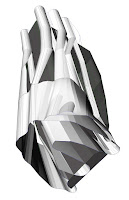
My first ideas about organic shapes came through when I first measured and created a model of a rock in the Wissahickon forest. At the time, I wasn’t sure why measuring in delaney triangulation was so important. But that measurement process allowed me to recreate the rock in model format. Afterwards, after some design decisions, my triangulation model transformed into a planer model. Five years later, when I look at my planer model today, I see the potential of the shapes I created. I understand how a simple rock can have the potential to be an organic living space. At the time, I was just following a method of measurement, but this is a great method to recreate nature, and create architecture that flows organically instead of creating boxed architecture.
Choreography
My ideas for organic shapes continued to evolve during my fourth semester, when we measured a choreography and then created space from it. This is also very organic because the shape that we created was a movement of the body. The human body is part of nature, and how it moves is fundamentally a supreme mechanism since we still can’t replicate the human body. But that’s difficult because the human body is made out of trillions of individual cells collectively controlling the body.
Movement
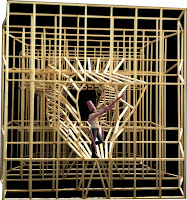
Furthermore, during my second semester, I had a digital course, where we had to design a physical movement. Now that I look back, I realize how truly organic that simple design process was. The process started with, each of us, documenting a movement. I chose to pick up my cellphone as the movement. After taking dozens of images of the process, we experimented with collaging the process to make it cohesive. Afterwards, we made line drawings of five main images. This allowed for experimentation because I was able to transfer the drawings into Rhino afterwards. As a result, we were able to create an organic shape from the movement. This space was eventually integrated with our arch studio.
Potentiality
The end images don’t actually justify the capacity that this method can produce. I think if I kept using this process, I would have had organic designs throughout all of my years at Temple. But, I didn’t apply what I learned effectively into my design. I started thinking about the required spaces that was essential for the architecture. And those required spaces became boxed spaces because of limited time. I started focusing on visualizing the space through digital programs. Interior architecture became more of a focus because I was thinking about how height and color of the space affected one’s perception. The programmatic value that I wanted to focus on for the occupants became a symbolic perception.
By focusing on colors and digital interior designing, my main objective became convoluted. Because ultimately, the program of the architecture is the most important part of the space. That’s where people will be walking through everyday. People don’t always look at their surroundings. Habituation shows that people tend to completely ignore what’s happening around them because consciously thinking is a very difficult process. Most people, everyday, follow routines in order to live day by day. And when time doesn’t allow for wondering, a person automatically follows the said routine without thinking. That allows for tremendous work to get done, however, the exploration that is possible dissipates. People actually look where they go when they’re in nature. Part of the reason for this is the uncertainty and natural life. When you don’t know what’s in front of you, the conscious brain becomes alert, because who knows, maybe a squirrel will bite you. That’s why creating space that is organic can open up the possibility for conscious action. I want people to pay attention to the spaces that they walk through. I don’t want to scare them, per say, but being uncertain about how the space will change while you walk through it can definitely enhance the spatial experience.